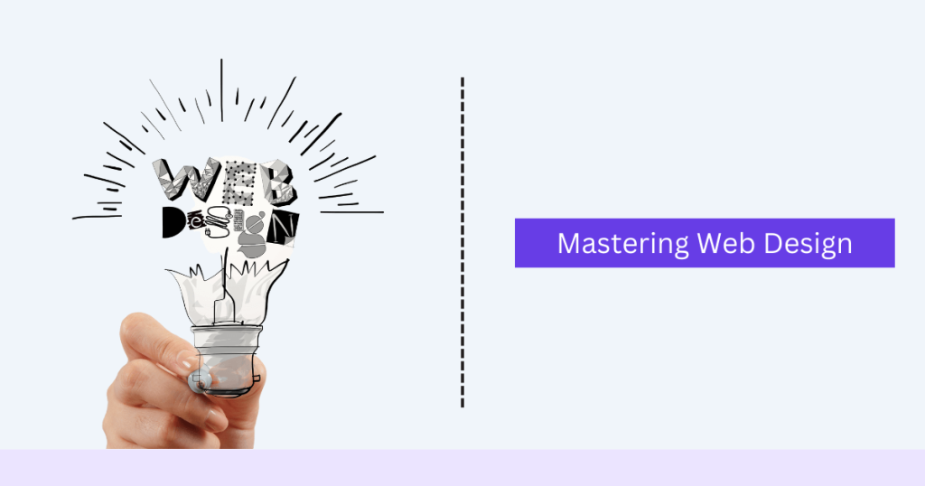
Mastering Web Design is vital for establishing an online presence. It entails planning, conceptualizing, and organizing content for the Internet. Good web design not only enhances the aesthetic appeal of a website but also improves its functionality, usability, and user experience. This article aims to provide a comprehensive analysis of the key factors that impact web design, discussing the tradeoffs involved in balancing different elements and exploring the challenges associated with various approaches. Additionally, the importance of considering the impact on users when making decisions about web design will be highlighted.
Basics of Web Design
What is Web Design?
Designing websites involves a range of skills and disciplines used to create and maintain them. It involves aspects such as web graphic design, interface design, authoring (including standardized code and proprietary software), user experience design, and search engine optimization. Web design is distinct from web development, which is the actual coding and programming that makes the website function.
Key Principles of Web Design
- Layout: The placement of visual components on a page. A good layout provides a clear visual hierarchy, guiding the user’s eye through the content in a logical order.
- Color: Colors can influence how users feel about a website and can affect their behavior. A well-thought-out color scheme can improve readability and make the website more aesthetically pleasing.
- Typography: The style and appearance of text. Effective typography improves readability and enhances the overall design aesthetic.
- Imagery: High-quality images and graphics can make a website more engaging and visually appealing.
- Consistency: Maintaining a consistent design throughout the website helps build a strong brand identity and improves the user experience.
Difference Between Web Design and Web Development
While web design focuses on the visual and aesthetic aspects of a website, web development involves the coding and programming required to bring those designs to life. Web designers use tools like Adobe XD, Sketch, and Figma to create mockups and prototypes, while web developers use languages like HTML, CSS, and JavaScript to build websites.
Essential Tools and Technologies for Web Design
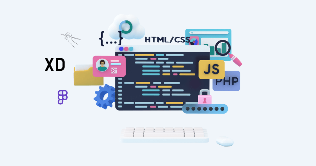
Design Software
Modern web design relies heavily on advanced design software. These tools allow designers to create detailed prototypes and mockups:
- Adobe XD: A powerful tool for designing and prototyping user experiences for web and mobile apps.
- Sketch: Popular among UI/UX designers for its vector editing and collaborative features.
- Figma: Known for its collaborative design capabilities, allowing multiple designers to work on a project simultaneously.
Development Tools
Understanding the basic languages of web development is essential for designers to communicate effectively with developers:
- HTML: HTML, the standard markup language for building web pages, furnishes the framework of a webpage.
- CSS: Used for styling HTML elements, CSS controls the layout, colors, fonts, and overall appearance of a website.
- JavaScript: A programming language that enables interactive elements on a webpage, such as sliders, forms, and animations.
Prototyping and Wireframing Tools
Prototyping and wireframing are crucial steps in the web design process. They allow designers to plan the structure and functionality of a website before the actual design and development begin:
- Balsamiq: Known for its simplicity and ease of use, ideal for creating low-fidelity wireframes.
- InVision: Offers robust prototyping features and allows designers to create interactive mockups.
- Axure RP: A comprehensive tool for creating detailed wireframes and prototypes, suitable for complex projects.
Responsive Design and Mobile Optimization
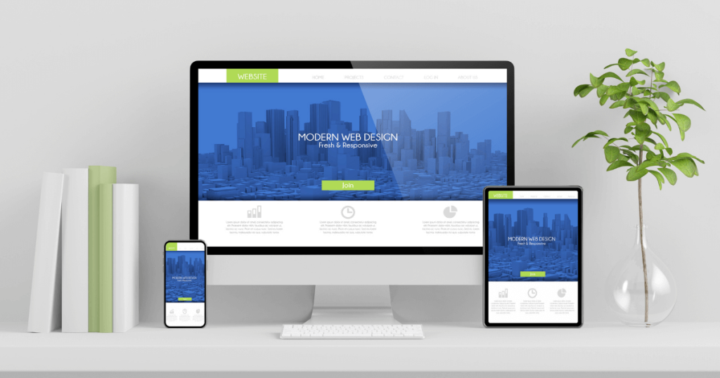
Importance of Responsive Design
As more people use mobile devices to go online, having a responsive design is crucial. Responsive design ensures that a website looks and functions well on all devices, from desktops to smartphones. This enhances user experience and can have a positive effect on search engine rankings.
Techniques for Responsive Design
- Fluid Grids: Using relative units like percentages instead of fixed units like pixels allows the layout to adapt to different screen sizes.
- Flexible Images: Ensuring that images scale appropriately within their containing elements.
- Media Queries: CSS techniques that apply different styles based on the characteristics of the device, such as its width and height.
Mobile-First Approach
The mobile-first approach involves designing the mobile version of a website first and then scaling up to larger screens. This ensures that the mobile user experience is prioritized and optimized. Techniques include:
- Simplified Navigation: Ensuring that menus and navigation elements are easy to use on smaller screens.
- Optimized Content: Prioritizing essential content and minimizing the use of heavy media files that can slow down loading times.
Designing for User Experience (UX) and User Interface (UI)

What is UX Design?
User Experience (UX) design focuses on the overall feel of the user when they interact with a website. It encompasses various factors, including usability, accessibility, and the emotional response of the user. The goal of UX design is to create a smooth, intuitive, and enjoyable experience for the user.
What is UI Design?
User Interface (UI) design is concerned with the visual aspects of a website, including the layout, colors, typography, and interactive elements. UI design aims to create an aesthetically pleasing interface that is easy to navigate and use.
Key Differences Between UX and UI
- Focus: UX is about the overall experience and functionality, while UI is about the visual design and interactive elements.
- Process: UX design involves research, wireframing, and user testing, while UI design involves creating the visual elements and ensuring they align with the brand’s identity.
Best Practices for UX and UI Design
- Research and User Testing: Understanding user needs and testing designs with real users to gather feedback.
- Consistency: Ensuring a consistent design throughout the website to improve usability and brand recognition.
- Accessibility: Ensuring website accessibility for all users, including those with disabilities.
- Simplicity: Keeping the design simple and avoiding unnecessary elements that can clutter the interface.
Website Navigation and Structure
Importance of Intuitive Navigation
User-friendly navigation is crucial for ensuring a positive experience. If users can’t find what they’re looking for quickly and easily, they are likely to leave the website. Good navigation helps users explore the website and find the information they need.
Different Types of Navigation Menus
- Horizontal Navigation Bar: Typically placed at the top of the page, displaying the main sections of the website.
- Vertical Sidebar: Placed on the side of the page, often used for secondary navigation.
- Dropdown Menus: Expandable menus that reveal additional options when hovered over or clicked.
- Hamburger Menu: A three-line icon that expands to show the navigation menu, commonly used in mobile design.
Tips for Creating Effective Navigation
- Keep It Simple: Avoid overwhelming users with too many options. Keep the navigation menu straightforward and brief.
- Use Clear Labels: Ensure that menu items are clearly labeled and easy to understand.
- Consistency: Ensure consistency in your website’s navigation structure across all its pages.
- Responsive Design: Ensure that the navigation menu works well on all devices, including mobile.
Typography in Web Design
Role of Typography in Web Design
Typography plays a significant role in web design, influencing readability, user experience, and the overall aesthetic of the website. Good typography helps convey the brand’s message and creates a visually appealing design.
Choosing the Right Fonts
- Legibility: Choose fonts that are easy to read, especially for body text.
- Web-Safe Fonts: Use fonts that are widely supported by all browsers to ensure consistency.
- Font Pairing: Use complementary fonts for headings and body text to create a harmonious design.
Best Practices for Web Typography
- Hierarchy: Establish a clear hierarchy by using different font sizes, weights, and styles for headings, subheadings, and body text.
- Line Height and Spacing: Ensure that there is enough line height and spacing between text elements to improve readability.
- Contrast: To improve readability, employ contrasting colors for text and background.
Color Theory and Web Design
Understanding Color Theory
Color theory involves the study of colors and how they interact with each other. It plays a crucial role in web design, influencing emotions, user behavior, and the overall visual appeal of the website.
Choosing a Color Scheme
- Brand Colors: Use colors that align with the brand’s identity and message.
- Color Wheel: Use the color wheel to choose complementary and harmonious colors.
- Accessibility: Ensure that the chosen color scheme is accessible to all users, including those with color blindness.
Impact of Colors on User Behavior
- Emotions: Different colors evoke different emotions. For instance, blue is commonly linked with trust and serenity, while red can evoke excitement and urgency.
- Calls to Action: Use contrasting colors for calls to action (CTAs) to make them stand out and encourage user interaction.
Multimedia Integration (Images, Videos, Graphics)
Importance of Multimedia in Web Design
Multimedia elements such as images, videos, and graphics enhance the visual appeal of a website and can help convey information more effectively. They can also engage users and improve the overall user experience.
Best Practices for Using Images and Videos
- High-Quality: Use high-quality images and videos that are relevant to the content.
- Optimization: Optimize images and videos to ensure fast loading times and a smooth user experience.
- Alt Text: Offer descriptive alt text for images to enhance accessibility and SEO.
Tools for Creating and Optimizing Graphics
- Canva: An easy-to-use tool for creating custom graphics and designs.
- Adobe Photoshop: A powerful tool for editing and optimizing images.
- Online Image Compressors: Tools like TinyPNG and ImageOptim can help reduce the file size of images without compromising quality.
Accessibility in Web Design
Importance of Web Accessibility
Web accessibility guarantees that everyone, including those with disabilities, can access and utilize a website. It is not only a legal requirement in many countries but also a crucial aspect of creating an inclusive and user-friendly website.
Guidelines for Accessible Web Design (WCAG)
The Web Content Accessibility Guidelines (WCAG) outline standards for enhancing web content accessibility. Key principles include:
- Perceivable: Ensure that users can perceive information and user interface components effectively.
- Operable: Make sure that user interface components and navigation are easy to operate.
- Understandable: Ensure that information and user interface operations are clear and comprehensible.
- Robust: Guarantee that content can be reliably interpreted by various user agents, including assistive technologies.
Tools for Testing Accessibility
- WAVE: WAVE is a web accessibility evaluation tool that offers visual feedback on a webpage’s accessibility.
- Axe: A browser extension that helps identify and fix accessibility issues.
- Lighthouse: An open-source tool for auditing the performance, accessibility, and SEO of web pages.
SEO and Web Design

Role of SEO in Web Design
Search Engine Optimization (SEO) involves optimizing a website to achieve higher rankings in search engine results. Good web design plays a crucial role in SEO by ensuring that the website is easy to navigate, loads quickly, and provides valuable content to users.
Best Practices for SEO-Friendly Design
- Responsive Design: Ensure that the website is mobile-friendly and responsive.
- Fast Loading Times: Optimize images, use efficient coding practices, and leverage caching to improve loading times.
- Content Structure: Use headings, subheadings, and proper HTML tags to structure content.
- Internal Linking: Create a logical internal linking structure to help users and search engines navigate the website.
Tools for SEO Analysis and Optimization
- Google Analytics: Supplies valuable insights into website traffic and user behavior.
- Google Search Console: Assists in monitoring and managing a website’s visibility in Google search results.
- Ahrefs: A comprehensive SEO tool for keyword research, backlink analysis, and site audits.
Trends in Modern Web Design
Current Trends in Web Design
Web design trends are constantly evolving. Staying up-to-date with the latest trends can help create a modern and engaging website. Current trends include:
- Minimalism: Sleek and minimalistic designs with generous white space.
- Dark Mode: Offering a dark theme option for users.
- Micro-Interactions: Small animations and effects that enhance user interaction.
Future Trends to Watch Out For
- Voice User Interface (VUI): Designing for voice search and voice commands.
- Augmented Reality (AR): Integrating AR experiences into websites.
- AI and Machine Learning: Using AI to personalize user experiences and improve website functionality.
Adapting to Changing Trends
- Continuous Learning: Stay updated with industry news and trends.
- User Feedback: Regularly gather and analyze user feedback to make informed design decisions.
- Flexibility: Be open to change and willing to adapt your design approach as needed.
Case Studies of Successful Web Designs
Analysis of Top Websites
Examining successful websites can provide valuable insights into effective web design practices. Key aspects to analyze include:
- Visual Design: How the visual elements are arranged and styled.
- User Experience: The general usability and functionality of the website.
- Content Strategy: How content is organized and presented.
Lessons Learned from Successful Designs
- User-Centered Design: Prioritize the needs and preferences of users.
- Consistency: Maintain a consistent design and branding throughout the website.
- Innovation: Don’t be afraid to experiment with new design techniques and technologies.
Common Mistakes in Web Design
Frequent Design Mistakes to Avoid
Even experienced designers can make mistakes. Some common web design mistakes include:
- Cluttered Design: Overloading the page with too many elements.
- Poor Navigation: Complicated or confusing navigation menus.
- Slow Loading Times: Large images or inefficient coding practices that slow down the website.
How to Identify and Correct Them
- User Testing: Conduct usability tests to identify and address design issues.
- Analytics: Use tools like Google Analytics to monitor user behavior and identify problem areas.
- Feedback: Gather feedback from users and stakeholders to make informed design improvements.
Future of Web Design

Emerging Technologies and Their Impact on Web Design
Technological advancements continue to shape the future of web design. Emerging technologies such as AI, AR, and VR are expected to have a significant impact on how websites are designed and experienced.
Predictions for the Future of Web Design
- Personalization: Increased use of AI to deliver personalized user experiences.
- Interactivity: More interactive elements and immersive experiences.
- Sustainability: Focus on eco-friendly design practices and reducing the environmental impact of websites.
Conclusion
Web design is a multifaceted discipline that encompasses various elements, from layout and color schemes to UX and UI design. A well-designed website can enhance user experience, boost SEO, and increase conversions.
Good web design is essential for creating a positive first impression and building a strong online presence. By understanding and implementing the principles of effective web design, businesses can create websites that are not only visually appealing but also functional and user-friendly.
In conclusion, web design is a dynamic field that requires a balance of creativity and technical skill. By staying informed about the latest trends and best practices, and by always considering the user’s needs and preferences, designers can create websites that stand out in an increasingly competitive digital landscape.